More is more when it comes to maximalist design. A concept that shuns clean and minimal. A style that invites clutter, embraces knick-knacks. That’s right, we’re moving away from reductive design elements and the art of hiding everything that doesn’t match your aesthetics inside a cupboard.
Maximalism is all about expression, of the freest kind. But there’s a fine line between maximal and messy. So how do you strike that balance to create harmony instead of chaos?
Your walls are the canvas of any room design, so make sure you get the foundation right first. From selecting the best wallpaper to setting the mood with colours, there’s a lot to think about before building up the layers.
Here are some of our top maximalist interior dos and don’ts to help you get started!
DO choose bold, rich colours

Mural in photo: What is Expressionism
Are you ready to move over to the dark side? Wave goodbye to clean white colour palettes and dare to indulge in something much richer, deeper and plentiful. If you’ve always loved bold hues like orange, they are definitely in this year.
Another way to make colours sing in your home is to adopt the two-colour combination, locking in two leading shades as the stars of the show. Mix and match your walls according to the direction of your windows, combine contrasting paints with your wallpaper, or brave doors, beams and ceilings.
DON’T forget about textures

Mural in photo: Dark Beauty
If there’s one thing you absolutely must not overlook, it’s the power of touch and texture. This is something that brings any interior design concept together. But it matters even more in maximalist design, because it helps to differentiate your layers, transforming ‘things’ into multidimensional markers to show depth and dimension.
Otherwise, your room runs the risk of looking lifelessly flat. And with maximalism, that means lifelessly flat and messy, which is a double no-no.
You can achieve a textured effect with a lot of surface textures. If you’re layering, try to select fabrics that are tactile in nature so they appeal to all the senses.
DO blend different periods and styles

Mural in photo: Eastern Chinoiserie
Maximalism is sort of like an interior designer’s time machine. You can travel to any decade, period or era, and you can bring it all together in one design story. The key to doing this like a pro is to blend everything seamlessly.
Regencycore can be mingled with art deco, and mid-century mod can be accompanied by 17th Century Chinoiserie wallpapers – which fuses together old and new.
It’s worth getting to know your interior history too. For instance, Chinoiserie was highly coveted in the 17th and 18th centuries by aristocracy, but made a widespread comeback in the 1920s, then again in the 1950s and 60s. So this style of wallpaper or fabric pattern probably goes with a lot more than you think!
DON’T skimp on maximalist design

Mural in photo: Colourful Garden
One of the biggest tips for making maximalism work is to have a healthy budget for your décor. Filling every space in your room is the heart of this design concept. But that’s not to say you should cram your home with junk!
Everything you buy needs to be considered because layering poor quality items on top of other poor quality items touches on hoarder territory, and your décor will look like an afterthought.
If you’re doing a maximalist makeover on a budget, the trick is to get the foundation right. A busy wallpaper ensures your space appears ‘filled’, even when it isn’t.
DO experiment with wallpaper

Mural in photo: Pink Jungle Passion
Ready to dive headfirst into your first maximalist design project? Then don’t hold back. This is the time for bold experimentation. Those crazy cool wallpapers you’ve admired for ages but always feared… now is your chance to embrace them.
Approach your wallpaper selection with unflinching conviction. If you like it, be daring enough to give it a go. Start small with a feature wall if you don’t want to go too hard, too soon. Then build the rest of your room around this main focal point.
Having one central area to base your creativity makes it easier to layer as you go, slowly writing a stylish narrative that keeps it classy, not messy.
DON’T be scared to clash

Mural in photo: Midnight Bouquet
Got your heart set on a few different patterns and prints? Love jungle? But also can’t resist the vintage florals? There’s no need to be exclusive to just one. In fact, clashing patterns in wallpapers and textiles is one of the signatures of maximalist design.
Of course, newbies may want to approach with caution, as too much clashing can just end up looking muddled. So avoid the frenzied attack of a kid in a sweet shop. Take a considered route, and think carefully about your favourite styles.
If you’re stuck, intense florals tend to be a good place to start. This is because floral fractals are intrinsically linked with nature, they provide comfort in their repetitive patterns, and work in just about any setting.
Whether your space is masculine, feminine or androgynous, an on-trend floral mural can bring it to life.
Are you a veteran of maximalist design in the home? Tell us in the comments below what your top interior styling tips are for getting this concept right!


![Emerald Green Home Decor Ideas [Room by Room]](/images/blogs/emerald-green-home-decor.jpg)

![What is Regencycore [And How to Style it at Home]](/images/blogs/Regencycore.jpg)

Michelle Gwilt
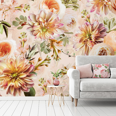
23/12/2024I love the designs not sure how choose for my lounge im really liking the colour peach and looking for inspiration
Nicole @ Wallsauce
23/12/2024Hi Michelle, here are some peach murals that you may like for your living room –https://www.wallsauce.com/designer-wallpaper-murals/cream-and-peaches - https://www.wallsauce.com/designer-wallpaper-murals/st-jamess-palace - https://www.wallsauce.com/designer-wallpaper-murals/flowering. If these aren't suitable, please email some of your inspiration to info@wallsauce.com and we'll see what we have 😊